Spelling Alphabets
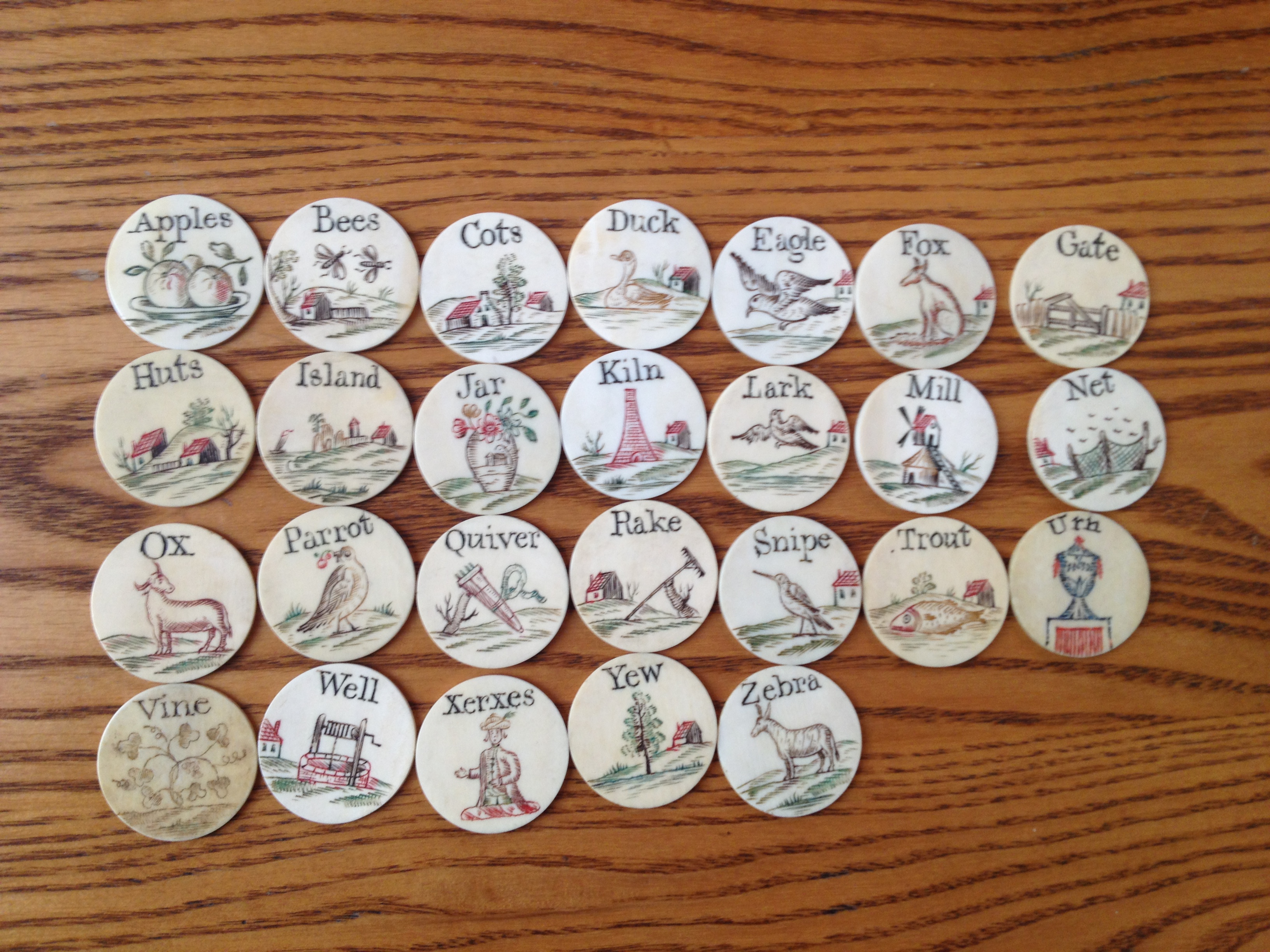
Writing manuals of the 16th century were created as illustrated training books as one of the earliest forms of distance learning. They were made to instruct literate students the specific hands and practices required to be a commercial scribe or secretary. They were often designed to be advertisements for the writing master as well, and as such, beautiful books in their own right.The 17th, 18th and 19th centuries expanded the scope and audience of writing books. Books concerned with teaching a wider audience the tools of literacy and communication became common. By the 19th century, British and American books, as well as toys, were being manufactured to address younger students. I wanted to concentrate on early writing manuals, but kept an eye out for material that fell outside of the 3R’s of standardized education. My experience with the Joseph SeavyWriter’s Assistant (more to come) had heightened my interest in the unusual, even if it wasn’t strictly a writing manual. Education expands one’s mind and horizons, just as this trip enlarged my understanding.Every time I visit a library, I take a trip. Often it’s far away from the present into some distant past. I’m transported to another landscape, another mind, another experience. The librarians I encounter are the custodians of these worlds. I enter through the portal of the reading room. Like any traveler, I consider myself a guest, trying to abide by local custom, leaving my assumptions behind. What passes as an acceptable practice in one library is verboten in another. What is the rarest of treasures here may be a commonplace rare book elsewhere.At the Firestone, I called up material from the Rare Books Division, Graphic Arts collection, and the Cotsen Children’s Library. All the material is accessed through the online catalog. The person paging items brings the material to the desk, and the desk attendant (sometimes a librarian) brings the material to the desk. Princeton allows more than one item on the table at a time, making it easy to either scan material or do a comparative review.The Cotsen Children’s Library holds a number of spelling alphabets in various forms. These are small, hand-held disks or rectangles where the letter is engraved into the surface and colored to show the letterform.
[gallery ids="1789,1788,1787" type="rectangular"]
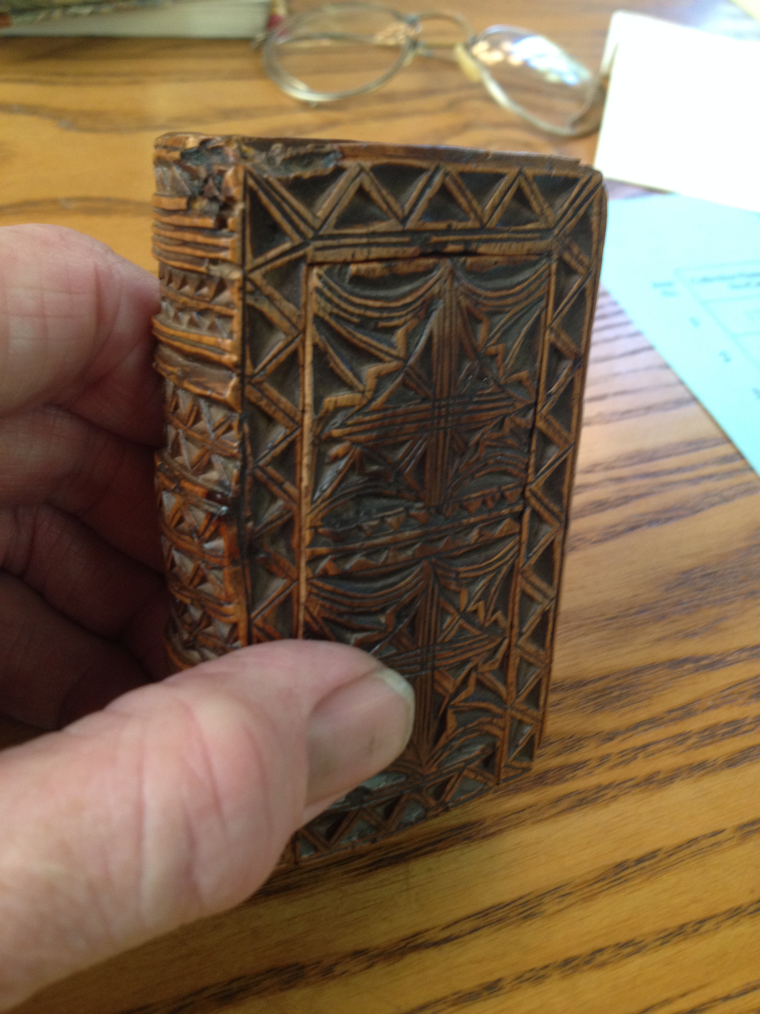
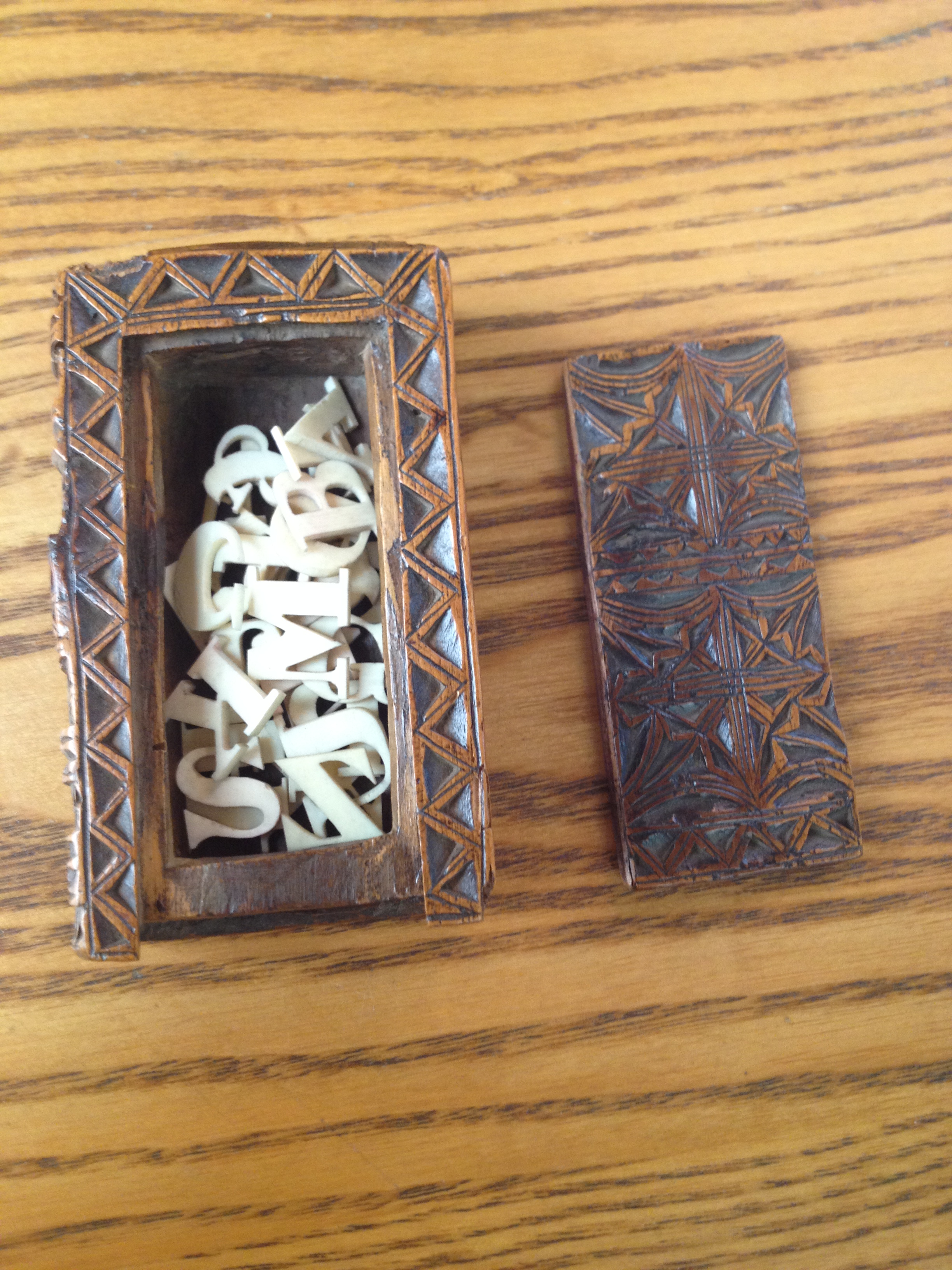
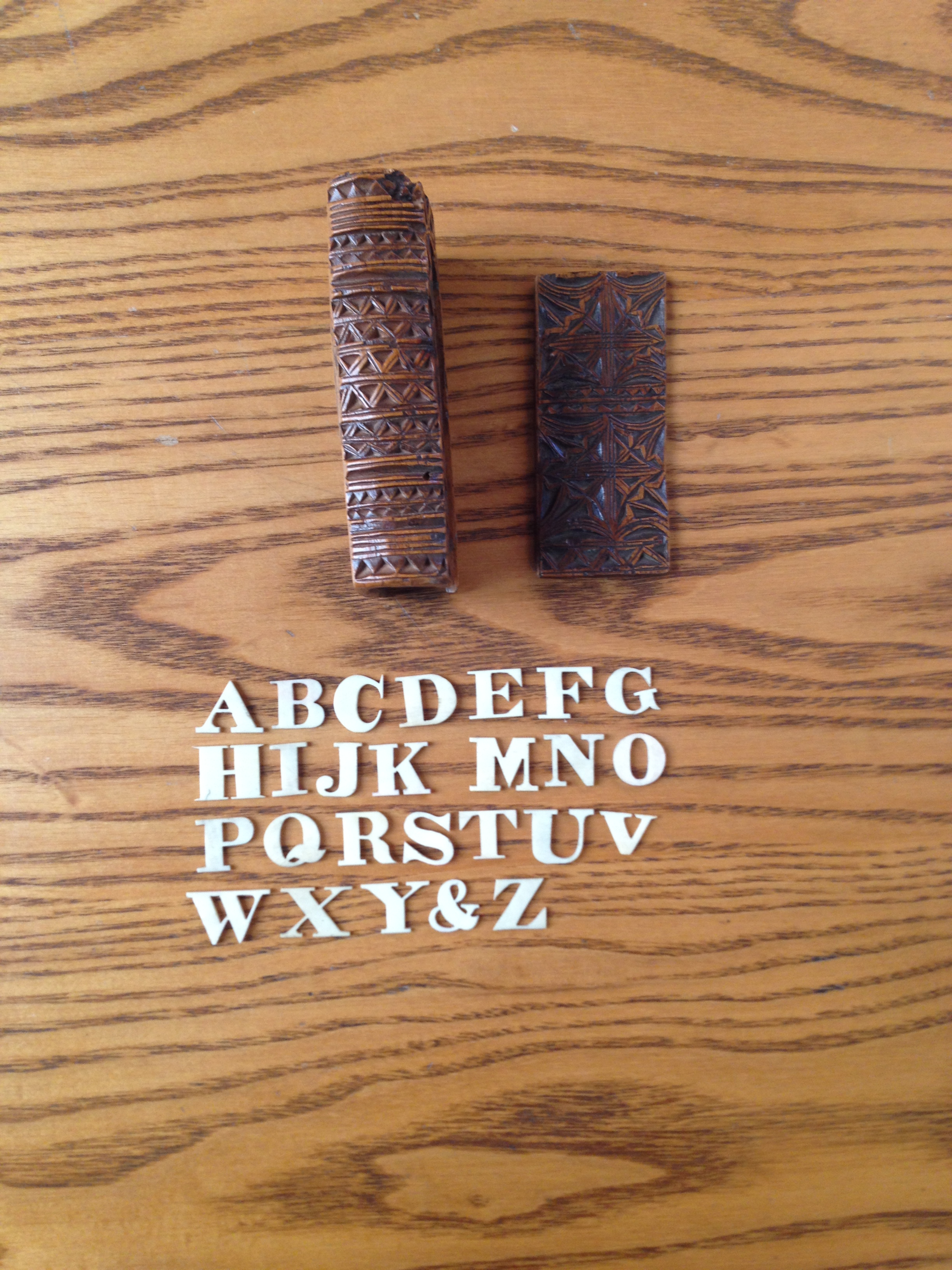
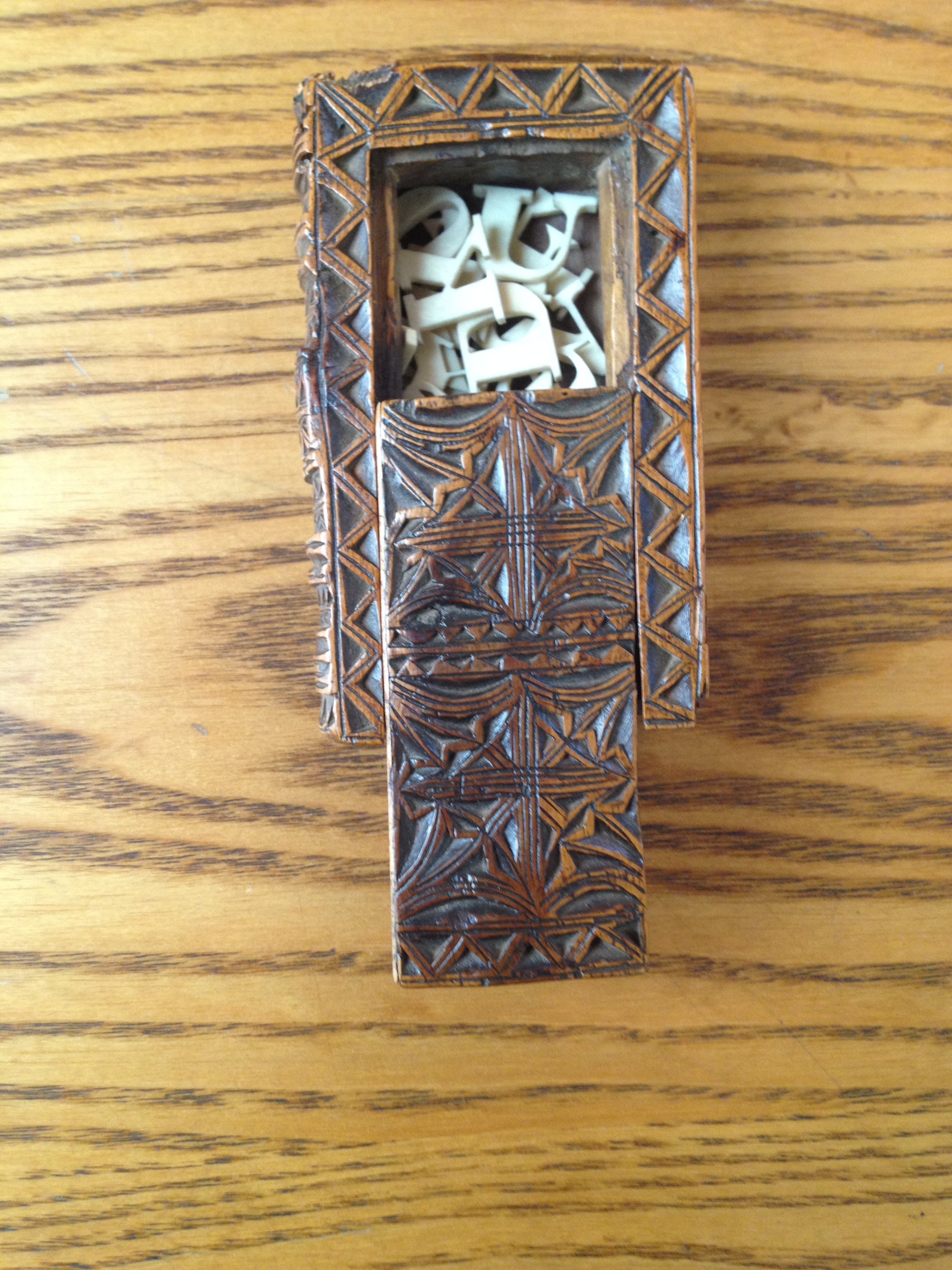
The ivory disks offset the colored letter, making me want to pick them up and hold them. There’s a satisfyingly organic connection when handling them which delighted me. In this particular set, the obverse of each disk had a 3 letter word accompanied by an illustration engraved and painted.At the same time, I called up “Alphabet of bone letters” which is housed in "wooden box in the shape of a book with sliding lid.” These little letters and their box were fun to play with and arrange. Cotsen’s librarian, Andrea Immel comments about cut out letters and dating from typographic evidence in this post. when I spoke to her about these objects, she was quite helpful in answering questions about this type of educational realia.
Going back in time, this German 16th century disk appears to be a teaching aid as well.
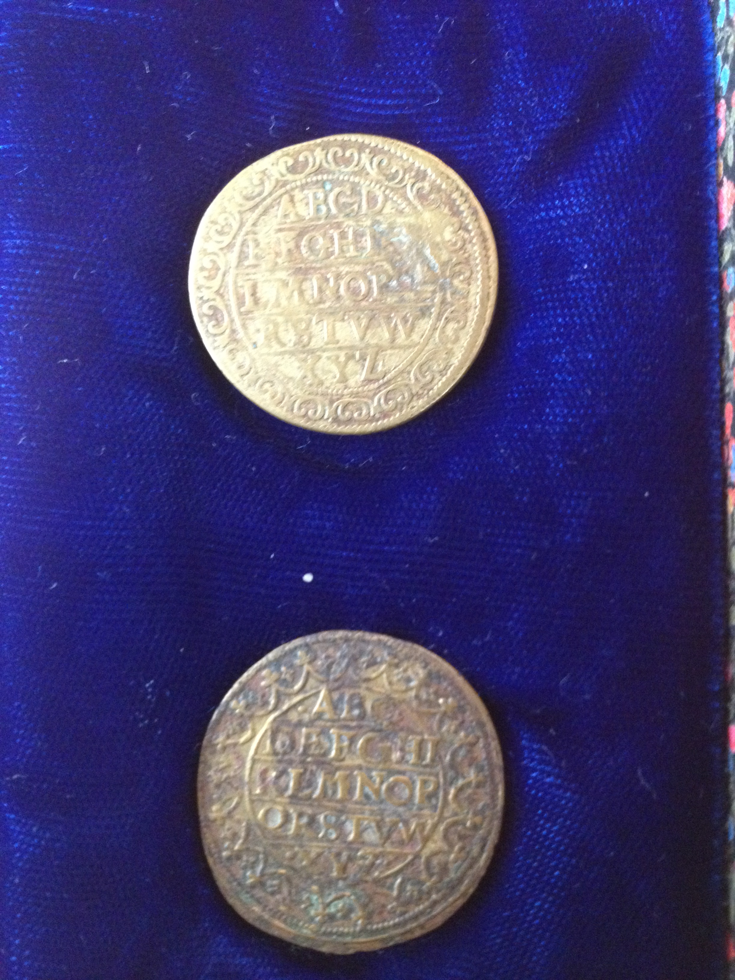
Realia designed to teach the rudiments of the alphabet and spelling (and reading) aren’t writing manuals, but I had to spend time with these materials because they do relate to scribal practice.On February 3 - 6, I will be presenting a bit of realia and typography at CODEX VII, a biannual book fair held in the San Francisco Bay Area. I have traced and modified letters from Giovann FrancescoCresci’swriting manual. Entitled Percussive Roman, the typeface is 100pt. type laser engraved by Magnolia Editions on maple dowels.
[gallery ids="1811,1812" type="rectangular"]
These are meant to be inked one at a time, then placed on the paper, with the impression being made by a blow from a mallet. While the typeface plays with reversed ground/figure relationships in type, the thinner, right-reading chip is part of a set of 53 characters in the Spelling Alphabet. I have added an ampersand to the set of upper and lower case letters. These are a direct outgrowth of the material I found in the Cotsen Collection.
Next post, I’ll write about the rest of the writing manuals and primers I viewed at the Firestone Library.